<Deposit> component for letting your users send funds to an address. You hard-code the recipient address, the destination network, and the tokens you accept; the end user only decides how to fund the deposit. It can render inline on your page, or as a button that opens the widget in a dialog.
How it works
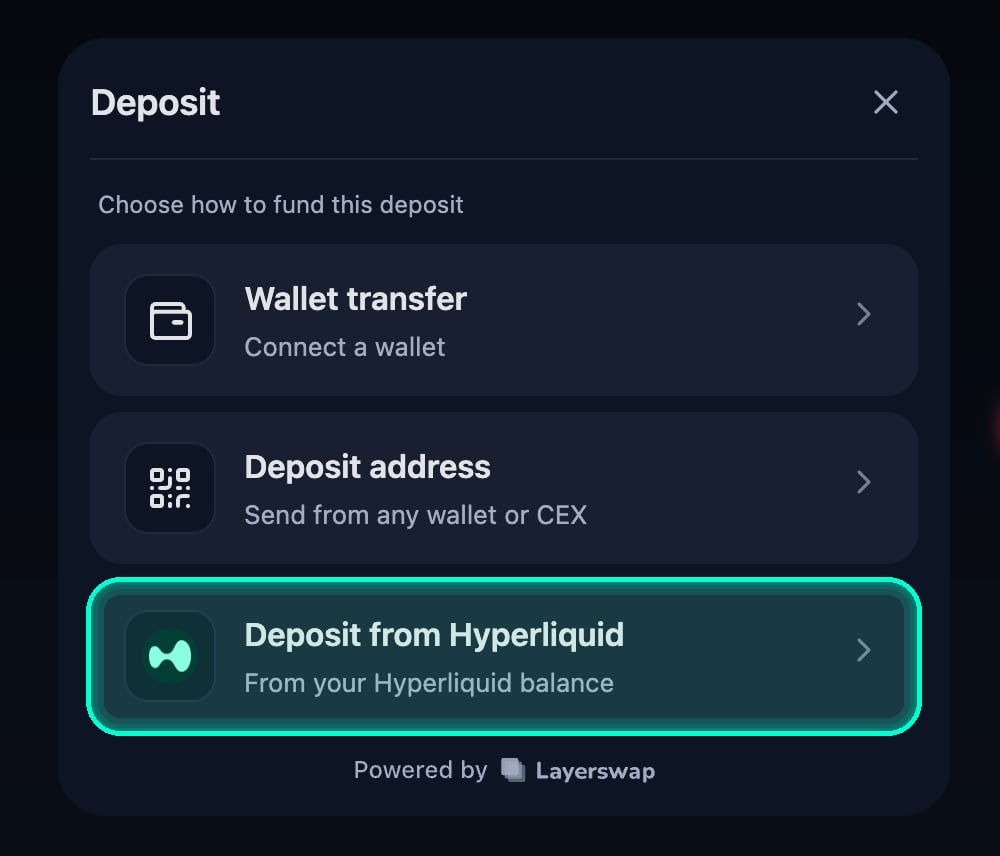
When wallet providers are configured, the user lands on a method picker offering a few ways to fund the deposit: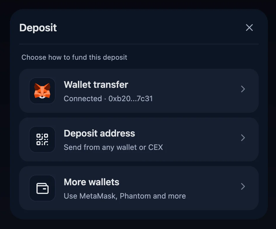
-
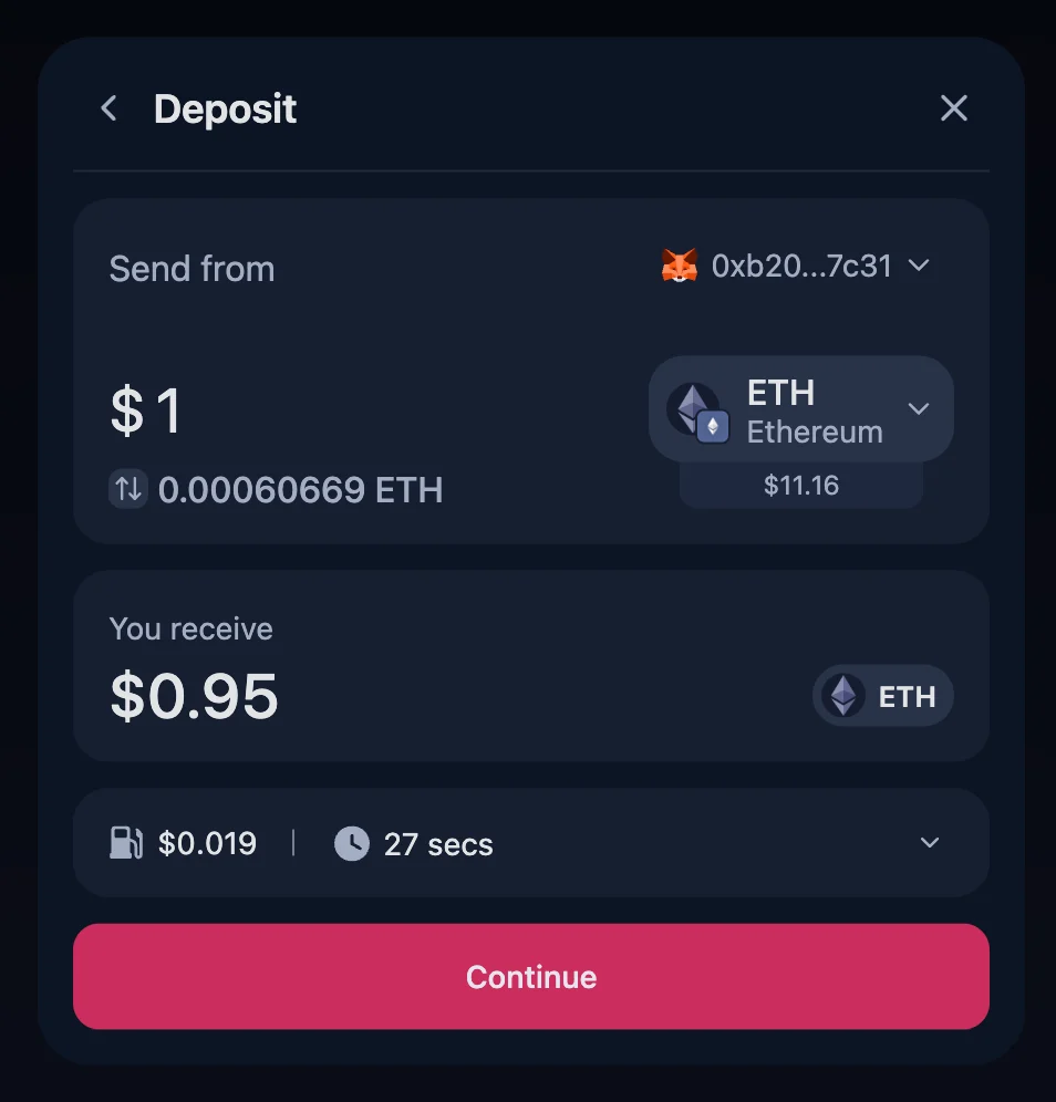
Wallet transfer — the user connects a wallet, picks a source token (only routes the wallet supports and has a balance for are shown), enters an amount, reviews the quote, and executes the transfer.
-
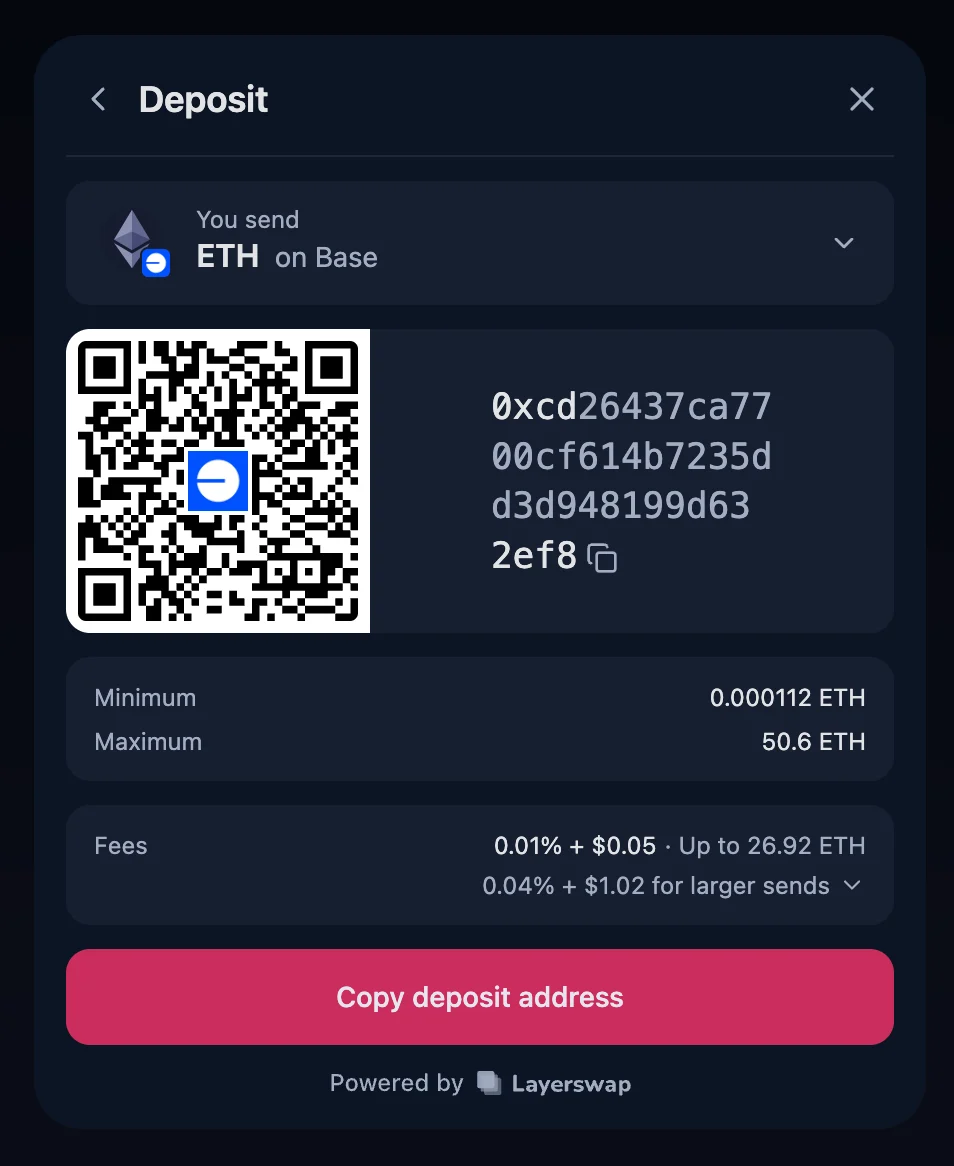
Deposit address — the widget generates a deposit address with a QR code. The user pays from any wallet app, hardware wallet, or exchange account. No source-side wallet integration is required.
- Deposit from Hyperliquid — when an EVM provider is configured and the destination is reachable from Hyperliquid, the user can fund the deposit straight from their Hyperliquid balance, without copying an address or leaving the widget. See Deposit from Hyperliquid.
destination prop; the accepted tokens come from its tokens allow-list. When more than one token is accepted, the user gets a “You receive” picker to choose between them; with a single token the picker is hidden and that token is used automatically.
If you pass no
walletProviders, the Wallet transfer method is unavailable, so the method picker is skipped entirely — the widget opens straight on the deposit address flow. This gives you a deposit-address-only integration with zero wallet dependencies.Installation
Import the component from the dedicated@layerswap/widget/deposit entry point along with the widget styles:
@layerswap/widget and the wallet provider packages.
Usage
A complete example rendering the widget as a button that opens a dialog:mode="inline" (the default). This example also accepts multiple tokens, so the user gets a token picker:
Deposit address only (no wallet providers)
OmitwalletProviders to skip the method picker and open straight on the deposit address flow:
Choosing which funding methods to show
By default every available method is offered. Passmethods as an allow-list to narrow them — only the listed methods can appear, and each still needs its own runtime conditions (e.g. wallet needs walletProviders, hyperliquid needs a reachable destination). For example, to offer wallet and deposit-address funding but hide the Hyperliquid option:
Inside an existing LayerswapProvider
If your app already rendersLayerswapProvider (for example alongside <Swap>), use DepositComponent instead — it’s the same widget without the built-in provider. Pass DepositLoading as the provider’s loadingComponent so the init state matches the deposit layout:
Deposit from Hyperliquid
Available in
@layerswap/widget 1.5.0 and later.createEVMProvider()) in walletProviders. There’s no separate prop to turn it on — the widget shows the option automatically whenever the destination can be reached from Hyperliquid.
'hyperliquid' from the methods allow-list.
Props
<Deposit> accepts the deposit props below plus the LayerswapProvider props (config, callbacks, walletProviders), since it renders the provider internally. DepositComponent accepts only the deposit props.
The single destination network and its allowed tokens. The network is fixed; the user picks one of the tokens via the token dropdown (hidden when only one token is accepted). See SupportedDestination for the shape.
The recipient address on the destination network. Fixed by you — the deposit widget never asks the user for it.
"inline" renders the widget directly on the page. "button" renders a Deposit button that opens the widget inside a dialog.Title shown in the widget header.
Label for the trigger button. Only applies when
mode="button".Extra
className applied to the trigger button. Only applies when mode="button".When
true, shows the “Send to” destination address row in the quote summary. Hidden by default because the recipient is your own fixed address and the row is usually redundant for the user — opt in only if you want to surface the destination address explicitly.Custom label for the action (submit) button inside the flow.
Default amount (in USD) seeded into the wallet flow once the user picks a source token. Set to
0 to disable seeding.Allow-list of funding methods the picker may show —
"wallet", "deposit_address", and "hyperliquid". Only listed methods can appear, and each still needs its own runtime conditions to be offered (for example, "hyperliquid" only shows when an EVM provider is configured and the destination is reachable). Defaults to every method. The DepositMethodId type and the full DEPOSIT_METHODS list are exported from @layerswap/widget.Provider configuration —
apiKey, version, theme, settings, etc. Only on <Deposit> (not DepositComponent). See the Quickstart for details.Wallet providers available for the Wallet transfer method. Including an EVM provider (
createEVMProvider()) also unlocks Deposit from Hyperliquid. Only on <Deposit> (not DepositComponent). When omitted, the widget runs in deposit-address-only mode. See Wallet Management.Event callbacks. Only on
<Deposit> (not DepositComponent). See Event Callbacks.SupportedDestination
While a transfer is in flight, the dialog’s close button is hidden and clicking outside the dialog doesn’t dismiss it, so the user can’t accidentally abandon an in-progress deposit.